Years ago, when mainframes were king, and the 3270 was the only way to court, there weren't many questions about interface design. Most people who used 3270-based applications wanted as much on the each screen as possible. You tried to make it look presentable, but the users would quickly memorize the layout anyway. And you only had two colors to work with anyway. It was important to get the key tabbing right. For productivity, however, most people who used these applications wanted as much information on the screen as possible. There wasn't any scrolling as we know it today. They didn't want to have to make another round trip to the system for another screenfull.
Now, whether web-based or client-server (and actually, they're all client server, aren't they?), the trend is to make the screen pretty, often at the expense of efficiency. And this can be annoying.
Applications that depend on relational databases often have too many panels to wade through to get something done, because of network and server latency. Often a designer that likes whitespace or pretty pictures gets to decide on the interface design. And that's a mistake.
Designing an interface these days is much more complicated than it used to be. At the very least you have to think about your user/client/customer. And it's clear that many designers ... don't.
Consider the New York Times site. Sure, they have the title, and they have to make room for ads. But for the space available, the NYT site offers as much information as possible on a single page, most of it "above the fold." There are often 6 columns on the start page.
Compare that with the Washington Post site, which typically has 3 columns, and a lot more whitespace. Is that better? Is it more informative? Is it easier to read?
The worst in this category is Time Magazine, where there is nothing but headlines on the start page. It's chaos in red-and-white; the page contains very little real information.
Colleges. Most college and university sites focus on marketing these days. Used to be that Harvard's page was bare bones, but informative. Now they all have big, splashy graphic images at the top, often rotating, or even Flash videos. You have to scroll to get any information. Worst are those that have no information at all on the home page, but only some links (that are sometimes hard to see). UT Austin, St. John's in Annapolis and Princeton, of the ones I've looked at recently, are the most informative. All the rest are merely pretty.
How about your organization's applications? Lots of white space, pretty pictures? Or is real information available right at the top?
skip to main |
skip to sidebar
Words, words, words ...
Susquehanna County News Bureau & Prout Lane Advisory Council
About Me

- Ted Brewster
- Harford, PA
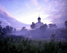
- The picture is of the Church of the Intercession (Церковь Покрова на Нерли) at the confluence of Nerl and Klyazma Rivers near Bogolyubovo (Боголюбово), in the Suzdal District of Vladimir Region, Russia, built in 1165.
Categories
About words
(1)
Army Daze (3)
Blue Ridge School Board (1)
Election 2016 (1)
General (2)
Great Bend Borough (1)
Harford (2)
In a Russian State of Mind (2)
Interface Design (1)
News (3)
Requires Some Disassembly (5)
Shemya (1)
SUNY Binghamton (1)
Tingley Lake (1)
Army Daze (3)
Blue Ridge School Board (1)
Election 2016 (1)
General (2)
Great Bend Borough (1)
Harford (2)
In a Russian State of Mind (2)
Interface Design (1)
News (3)
Requires Some Disassembly (5)
Shemya (1)
SUNY Binghamton (1)
Tingley Lake (1)
Archives
- December 2016 (1)
- April 2011 (1)
- March 2011 (2)
- July 2010 (1)
- April 2010 (1)
- March 2009 (3)
- November 2008 (3)
- July 2008 (1)
- May 2008 (1)
- April 2008 (5)
 Atom
Atom